Thursday, 12 January 2012

Strobist Lighting for Food Photography

I was recently solicited to photograph the new and exciting menu at a local restaurant Le Bateu in Ashley Cross Poole, if you haven’t already, check out their amazing food and nightlife. I have shot for these guys before and the brief both times was to provide colourful, simple and bright images. I love shooting food so this was a great gig for me. I’ll talk you through it...

There are MANY ways to shoot food not all of them requiring you to remortgage your property (see my blog post from last year).

For me there are three key points. Firstly perspective: some people will try to shoot from above the dish! Big mistake, I always think of a fast food take-away menu where you squint up at the boards and carefully select which grease filled kebab you want to stuff your face with. I like to set up on a dinner table and sit at a chair. This will give a “diners” view. It is how the food is going to be viewed when it is brought to the table. Subconsciously this works best for me.

Next, lighting always a challenge but the fun part. Take a look at Google, search food pictures. One thing you will notice is that predominantly you will see a strong backlight. So the back light is our key/main light and we base all other lights from there (see below how I have built the lighting).

I’m a sucker for shooting on white backdrops, for food this works especially well as the client is offered more versatility with regards to making menus, posters ECT. Upon delivery of the pictures, they can take them and seamlessly slot them into any marketing or promotional material they want. Also I feel this method provides a clean look that offers no destractions to the eye what so ever.


Let’s take a look at the role each light plays:
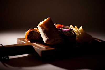


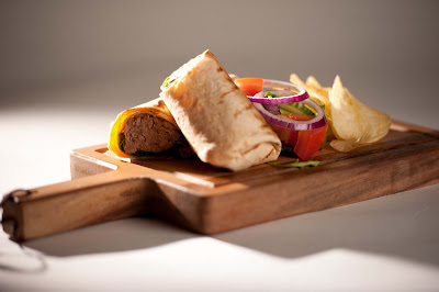
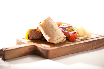
Demonstrated by this delicious (and reasonably priced) Tuna Wrap. We can see here that we start with our key/main light, this was an SB-600 with a Honl 1/4 grid for specula light with plenty of direction to hit the food right across the top without giving me lens flare problems. Admittedly in this example she is a little hot but for an illustration we can see how this light will provide the shine, shape and give the photo depth.
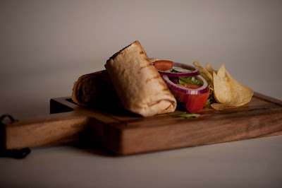


OK, lets add a second light, some fill provided by this SB-900 via a Lastolite 54cm softbox at about 45 from camera position off the right. I have gridded it for extra control. This will fill the shadows and give a three dimensional feel the plate.


Next I lit the backdrop (A Colourama "Arctic White" paper off-cut) with a Lastolite 40X120 strip softbox mounted on a heavy duty boom stand upside down and positioned horizontally above the paper.
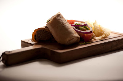


We use the internal and external baffles to stop hard shadows forming in front of our subject.

NB: Another way to combat this would be to move the plate further from the back drop, a luxury I did not have on this occasion.


Here is the set up from my position.
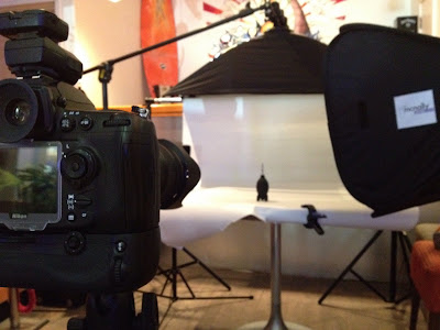


So lets take a look at these lights now put together side by side:


You should now see that each light 'sauce' ;-) ....excuse the pun, has it role to play.

I used PW's to trigger my flashes and shot predominantly with the Nikkor 105mm Micro. To give a different feel on some dishes I also shot with a 24mm lens to give an augmented feel to some of the plates.

Some will say not to cook the dishes, and for full time food 'togs' perhaps this works best, however I find that a freshly cooked meal and ready set up studio is fine.

Do make sure you have a generous supply of kitchen roll handy and perhaps on occasion a spray bottle of olive oil to add shine if required.

This is a nice, quick and clean method of shooting food.

Enjoy
Wednesday, 5 January 2011

New Year's Resolution = be a better blogger. Travel Photography


When recently updating my PC, I was trawling through my images in order to archive them. I soon realised how easy it can be to forget/disregard past images. I always had it in my mind that it was somehow painful looking at pictures I had taken years ago, as at the time I didn't know one end of a camera to another. Then I realised what it was that got me started on my journey of photography.


I was trying to pin point it. It is not anything to do with gear (you know us photographers are all obsessed with our equipment), after all how can it be? All I had at the time was a "crappy" 'point and shoot' with a 2GB card (can you imagine flying three thousand miles with only that as your photographic equipment?)!!
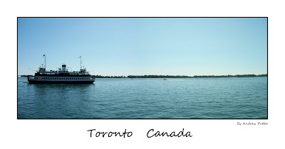
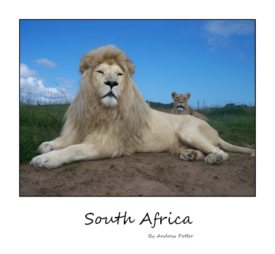
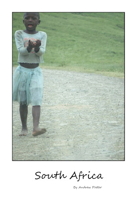
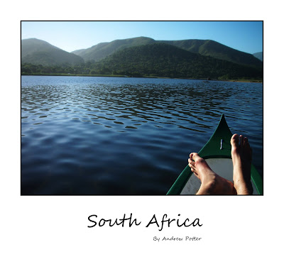
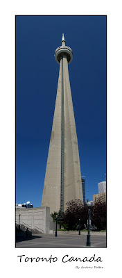
A Kodak V610 for those who are interested, sure it had some great features like the auto panorama setting that would stitch up to three images together in camera (see the above two images). It really was nothing to do with the camera itself at all, nor its features. The technique isn't imperative either.
It was all about capturing the scenes I saw in front of me and trying to bring them home for friends and family to see in an attempt to convey what I had seen - isn't this what photography is all about?


Strip away all the lenses and latest sensor chips and let's see what it was that really got me into photography.

What makes a strong image?


Content - I think generally things that impress you at the time of capturing an image will impress your piers back home, for example: differences in culture, dress, architecture, weather, landscape. Different plant life, wildlife, vehicles, the list goes on.


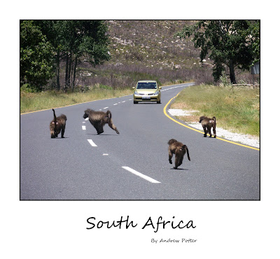
This scene above caught my eye. The baboon, one of many species of animal that ran out in front of us whilst driving on our 1,500km journey across the coast of South Africa, others included a giant tortoise and a wild dog, that spectacularly met its demise crossing the busy motor way.

Composition - Not something I knew a lot about, but scary to see how things I have learnt about since were already present in some of my old pictures.

Keeping your eyes open - Capturing the moment - having the camera in your hand, switched on and ready.


This really has shown to me it's not all about mega pixels or who has the largest aperture, its about simplicity and emotion.

Have a dig through your past pictures and see what you can find....


Tuesday, 1 June 2010

Child Photography


Photographing children is a instant winner, firstly, people love kids so naturally photos of kids are going to catch people eye, secondly as kids grow up and change so much making it important to preserve memory's for years to come that is why shooting children is always an interesting and fun experience.

But don't be fooled, its not all child's play (ouch!!) I thought I would share with you some golden 'rules' I follow when photographing the little people.

1) Preparation. Make sure you are prepared, ask your self, have I got the right gear for this shoot? (see 'Equipment' below) this also means setting your camera up correctly, Manual Mode will NOT be the best option for you here, even if you do have the quickest thumbs in the west. Aperture Priority or even better Shutter Priority will see you right.. whilst on the subject of Shutter speed one very good rule when photographing kids don't try to use a shutter speed less then 1/120th (1/100 at a push) normally I would say that hand held exposures I wouldn't worry unless I dropped below 1/60th BUT kids don't tend to sit still (and why should they?) whilst blur can be creative sometimes that's where shutter priority is the best option for you so that YOU can choose when to add that little creative sparkle and not when your trying to get a nice razor portrait.
ISO. Get that ISO set high, not too high so that you loose image quality but higher than you normally would allow again normally I would recommend leaving your ISO at its native (200 in most cases) BUT Its always a good idea to allow for changing light as you move around which brings us nicely to ....

2) Point of view. I see sooooo many photos taken of kids from an adults point of view, that is from above their head hight (shooter stood upright with the camera planted to their face). GET ON THE FLOOR, try to shoot from no higher than the child's hight this will give a unique point of view and will further identify the CHILD as being the main point of interest. This rule as always is there to be broken (see image above) this is a good example of using lenses properly.


3) Equipment. I try to avoid using prime or fixed focal length lenses on children as It will not give you enough flexibility and as you on the floor (remember?) its not going to very easy to jump to your feet to move back three feet as the subject has just run over to you with his/her ball, I find the coverage of a wide angle such as a 14-24mm or the 12-24mm or maybe the 10-20mm or mid range lens 17-55mm or the 24-70mm to be ideal they give a close personal feel as opposed to say using a telephoto which would require that distance that is not going to hold the child's attention or focus.
Remove any battery grips, flashes, lens hoods or of other un-needed accessorys if possible in an attempt to make your camera look as small as you can, this will help relax the child as they may not have ever seen a chunky SLR before it could be quite menacing.


4) Bribery ;) I always carry lolly pops and sweets in my camera bag to reward good children it helps A LOT to settle crazy kids. (remember to get permission from the boss first though)


5) Props. If possible gather an arsenal of their favourite toys, teddy ect with mummy or daddy to help entertain. this will keep the child interested enough for you to squeeze off a few frames.


As always any comments or questions below.

Friday, 26 March 2010

Photography for a Rainy Day.


If your anything like me then you will be wanting to take pictures all the time, if so then you don't want to let rain put a stop to your creativity. On a rainy day you will find me trawling through 'youtube' looking for ideas for great photo ops that can be achieved indoors, and I'm pleased to say there are literally hundreds.

This particular idea is stolen from Bryan Peterson, I am a subscriber to his 'youtube' channel and I find his videos fantastic, full of ideas and information not to mention double helpings of American cheese to go with it. In this video Bryan has his own motives behind the shoot but I have simply applied the English weather theory instead of Mr Peterson's earth saving one.


http://www.youtube.com/watch?v=SCYG7HO_SZo&feature=related

Here is my set up for the shoot:


Its all very simple, fill a shallow dish with warm water add a tiny bit of vegetable or any clear oil, suspend the dish roughly 10cm from a colourful backdrop (in my case an Xbox game case) remember to move the background after each shot to give you endless colour and shape possibilities. Shoot with a large aperture to give reasonable depth of field i.e f/8 or below, this will ensure that the background is out of focus as it is only the colour that we need. I added some flash with a red gel to spice things up a little - this is optional though. Also if you do not have a macro lens you can use close up filters or a 50mm f/1.8 for example this should work just fine.

Its all about colour and shape which is what photographers look for everywhere they go.

Questions and/or comments below.

Tuesday, 23 March 2010


Its definitely time for another post on the blog, another photo for a wall only this time its not ours but my mother in laws.

This is the flower we brought her for mothers day and thought it would be a great idea to give her a print of it for her birthday.

So a quick easy picture was in order, as it happens quite often, I had a picture in my mind already of how I wanted the image to look, I knew I wanted a dark black background, I wanted the picture to be taken full length and shot side on (i.e. not looking down on the flower head for example)

I started by rolling down our bedroom blind over our washing basket and placed the flower on it. I set up a tripod and camera with a cable release and chose to use a 60mm Macro lens (mainly for its sharpness) I then got out a flash and held it with one hand with the cable release in the other making it easier to move the flash around the subject, above, below, in-front and behind checking the LCD screen each time to make sure I was getting the exposure correct ect, it was a very crude set up but it worked.

THIS image should give you a better idea of the set up....


This was one of those times where you get everything set up, dial in the flash power and aperture ect and take the first picture and smile to yourself because the first frame is exactly what you had in your head, I do love it when that happens :)

The exposure was f/11, flash power set to 1/8th from memory. My one and only snag was that the light from the flash was occasionally hitting the background which was actually a dark blue so this was spoiling my black background look, so a quick fix was to put together a make-shift flag out of card and put in on the side of my flash then secure it with an elastic band, this worked a treat and kept the light from straying onto my home-made backdrop and kept everything black.

In photoshop it was just a matter of cleaning up a few stray leaves at the bottom of the image using the paint brush tool and zooming to check detail.

Quick, easy and, I think effective.

As all ways any questions or comments stick em below.

Thursday, 25 February 2010

Food


As those Python Boys would say "and now for something completely different".

Food, a subject I hold very close to my heart. The story here is once again the need for something to go on our walls at home, this time for the kitchen.

I knew I wanted that popular clean white background look so that the entire focus of the eye is on the subject, in this case fruit and veg. There are, I'm sure many ways of doing this but here is how I achieved it.

Things you'll need:

Your camera
Sheets of plain white A4 paper (the boring office kind will do)
Two or three Speedlights
Bluetack
Photoshop (or any other good editing software)


I started by making a box shape out of the sheets of paper, securing them with the blue tack and placing the speedlights behind them. The sheets of paper would act as diffusers, nicely lighting the food and keeping the background nice and white.

I shot with my camera tethered to my laptop via USB and 'Nikon Camera Control Pro 2' software. This would speed things up considerably, allowing me to view the images on screen in real time, assess and make adjustments if needed. Once I had roughly the image I was looking for it was a case of opening it up in PS using a bit of the paint brush tool to iron out that white background a little or, in fact for most of the pictures I used the select tool to select the item of food, inversed the selection and simply tweaked the brightness getting the background back to pure white.

As for camera and lenses, I used the Nikkor 50mm f/1.8, I triggered the speedlights via 'CLS' or 'Creative Lighting System' basically, in a nutshell using the onboard pop-up flash to talk to the speedlights telling them not only when to fire, but how much power ect. I find it to be quite an easy system to use, generally I use it on manual as It gives more consistent results, but I do have to say I find iTTL to be a safe/quick option too when needed.

In this case I was in 'A' mode, ISO set to 200 and power output of the flashes at 1/16th of the power (again to make the background as white as possible). I set the aperture to f/1.8 and I decreased the aperture size until the correct look was achieved, and took a few frames with that.

I moved the speedlights around until the shadows were where I wanted them to be, on some pictures I used the pop-up flash as a fill light too.

Each different item of food produced a different lighting challenge which made it quite a lengthy but fun exercise.

I also made this time-lapse video to help illustrate what was going on.


Hope this helps, Don't forget to subscribe and comment if you need further information.

Wednesday, 24 February 2010

Malaga Night Shot


Another Landscape, during a recent trip over to Spain I made it my mission to get some pictures to print to grace our walls at home.

We knew from previous visits to Malaga that there is a great view point where you can see the city, not too far away from where we were staying with my Brother. The only problem was the hike up to it - quite a steep climb up many steps, BUT as they say 'no pain no gain'.

We made the climb of death up to the view point just as the sun was dropping below the horizon. I got my breath back and set up the tripod and took a good look around. I think there are a lot of times where you can easily be so eager to get shooting that you slap the camera to your face and start firing away without taking a good look around at what there is - it can be so easy to miss great shots that way. Someone once told me "look back and look up" and I really do feel that is a good philosophy to follow. There are many times where I remember this, and turn around to a great shot that I was walking away from and would have missed.

So after a good old look at whats about, I turn to my camera bag, get the body nicely secure on the tripod and think about lens choice which this time for me was an easy choice as I wanted to used my newly purchased Nikkor 10.5mm f/2.8 Fish Eye, a great lens because of its 180 degree field of view, but perhaps not the first choice for landscape due to the heavy distortion BUT after sticking it on the camera and taking a few shots I was happy with the wide coverage I was getting. I find that IF you want to use this lens in these circumstances the best practice to place the horizon slap-bang in the middle of the frame, that way it keeps the horizon straight (althought it does make some interesting images if you break that rule too).

By now the light is fading fast so to get any kind of colour out of the sky I would have to move fast. I started off by setting the ISO down to its lowest setting to keep the picture free from noise and as I was on a tripod this would not give me any problems. Next, to keep everything sharp I used 'Aperture Priority', set the aperture to f/22 which is the minimum for this lens which gave me a shutter speed of 30 secounds, again not a problem because the camera was steady. White balance was auto as I'd be tweeking that later. As for metering I chose to use 'Matrix', spot was making too many silhouettes of the forground, focus to manual and set to infinity, although at this aperture who cares - everything will be in focus. Not forgetting to use 'Exposure Delay' to lock the mirror up and out of the way as not to shake the camera when I fire the shutter.

I took plenty of shots, playing around with angles and moving up and down distorting the horizon, moved around the view point looking for different angles, used a few different lenses getting detail with the Tele for example. Once I was happy that I'd covered all I could, we made our way back to base and took a closer look at the results. With this particular image I actualy edited in camera. I adjusted the white balance a little and saved it as a jpg file and hey presto.


Remember any questions or comments pleases stick 'em below or email me.

Monday, 22 February 2010

हाउ इट्स दोने.


So here we go, my first post on my new blog.

The idea here is to post about my photography (obviously) but also to give a little insight into how some of my photographs are taken instead of simply just showing off my work, in the hope that maybe some of you out there will perhaps learn from my mistakes and/or get ideas into furthering their photography.

So image number one, and I have chosen this picture to start because for me, it typifies what I love about photography. This was taken on the way home from a day at work, I am a firm believer in taking my camera everywhere possible even if it means leaving it in the boot of the car or packing a small backpack with a body, a choice of lenses and perhaps a speedlight say, but one thing I never leave home without is my Manfrotto (Bogen) 'Super Clamp' with a ball head mounted on it, its lightweight and so easy to fit into my small back pack (which by the way is a Lowepro 'Slingshot 100AW' for those who are interested) the only downside to this however is there has to be something to clamp to, but I haven't yet been stuck without and lamp-post, railing or wall to use (touch wood!!)

As I was driving home I knew I to had to pull over and get a shot of the wonderful sunset that was unfolding, so I drove up the road until I saw the angle I wanted.

Now, I knew from experience that a shot in this low light would either require high ISO setting (which is always a last resort as far as I'm concerned because of the loss in image quality due to 'noise') OR use a steady surface. In this case my choice of stability for the SUPERclamp was a good old fashioned park bench. Because of the versatility of the ball head I was able to compensate for the dodgy angle it provided me and keep the camera level with the horizon which is kind of a golden rule in landscape photography. So, using the composition grid over-laid on to the the view finder image (very useful by the way), I levelled up the shot.

Now I always try to take second to think about how I want my picture to look, in this case I wanted that dreamy look on the sea which is achieved by leaving the shutter open for extended periods of time, which was not a problem in this circumstance because my camera was all clamped up and wasn't going anywhere. I needed a long lens to get me over the wall which was about 3ft in-front of me so I used my Nikkor 70-300mm f/4.5 and set the ISO to its lowest setting to make sure I got the best quality, set the camera to 'Aperture Priority' or 'A' mode, set the aperture to f/11 (I always try to use f/8 or f/11 where possible as they are generally speaking the best for quality and saturation ect). Why f/11? well I wanted the shutter open for a longer period of time so f/11 was the obvious choice over f/8 which would have meant the camera would have selected a slower shutter speed because of the extra light that it would have allowed in to the sensor. To minimise vibration I used the 'Exposure Delay Mode' which flips the mirror up then fires the shutter eliminating any movement caused by the mirror. Then I pulled the trigger.

I took several shots from different angles, each time making sure I checked the results on screen, zooming in to check focus (which was manual and set to infinity and beyond). I knew I didn't have to worry about white balance because I was shooing RAW so I would tweak that later in Photoshop anyway, but I think I set it to Open Sun just to give me an idea. I also experimented with metering, which determines where the camera reads the light from i.e. the centre of the frame or an average of the entire frame. In the end I settled for the latter - 'Matrix'.

Once I had a few shots (and by this time the sun was gone anyway so it was time up) I packed up and continued on my way home for dinner.

Later that evening, I put my memory card into my laptop and opened up the photos. I quickly browsed through and deleted the ones I didn't like, short listed the ones I thought would work best and one-by-one I opened them in photoshop, again just really only tweaking the white balance and blacks a little. I do make a big effort to try and get the picture right at the time I'm taking it, as my post processing is not yet as great as it could be and it saves work in the long run, so once I've edited all the chosen pics and added my logo, I re-save them as high quality jpg files and there you have it, my creativity for the day is done.


If you have any questions please post them or e-mail me andypotter3@hotmail.com.